

Different Reports Were Producing Different Versions of Performance
Teams had access to data, but definitions, reporting periods, and calculation logic were not always aligned. Leaders spent valuable meeting time reconciling numbers instead of discussing action.
The project therefore treated metric governance and decision context as seriously as dashboard design.
Designing from Decisions Backward
The team first identified recurring management decisions and the indicators behind them. Data modelling and interface design were then organized around those practical needs.

Governed Metrics with Progressive Detail
Shared Definitions
Each priority metric has an agreed source, calculation, owner, and refresh cadence.
From Signal to Detail
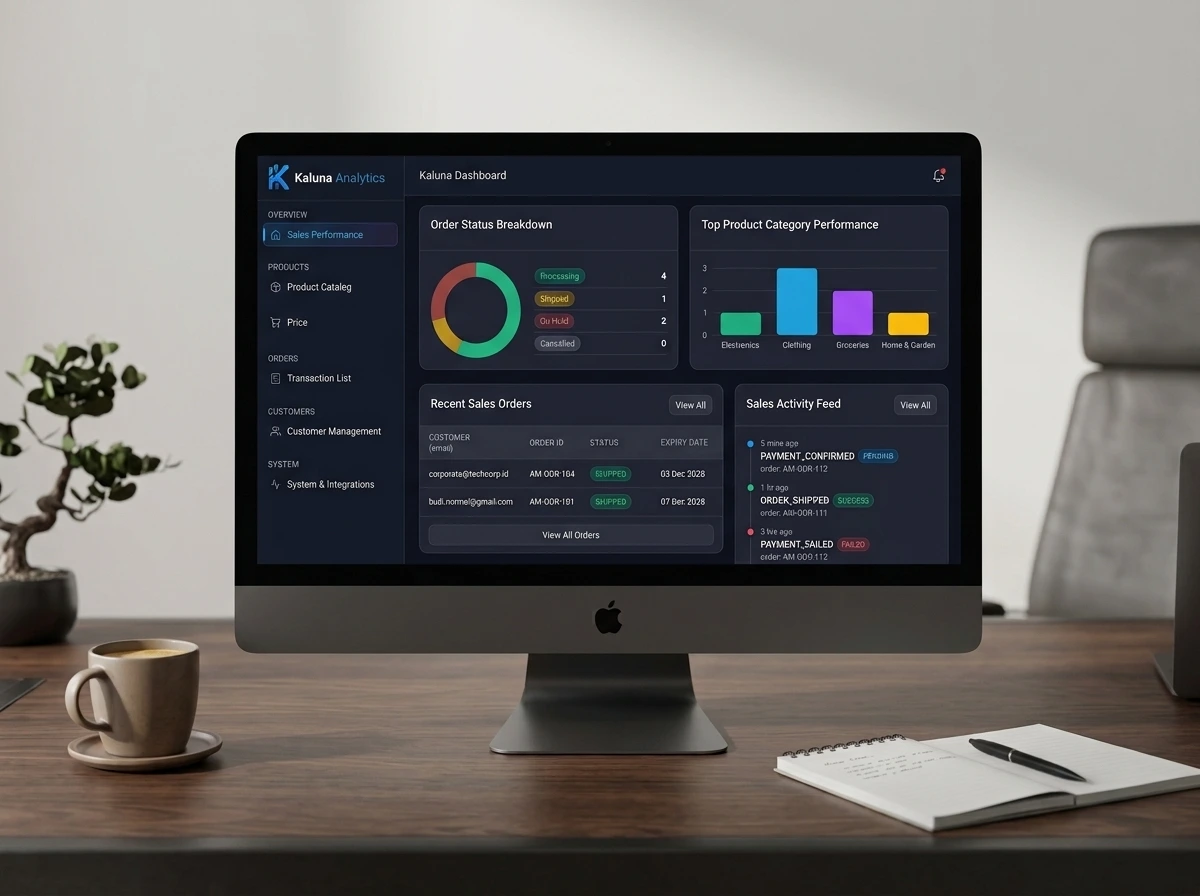
Summary indicators lead users into the relevant operational breakdown without placing every chart on one screen.
A Shared View of Performance
Consistent definitions and focused visual hierarchy made the dashboard useful across operational and leadership conversations.
Teams can now spend less time validating the report and more time investigating causes, agreeing priorities, and tracking follow-through.